WorkSecond Opinion
A telehealth app that connects patients to a certified doctor in minutes.
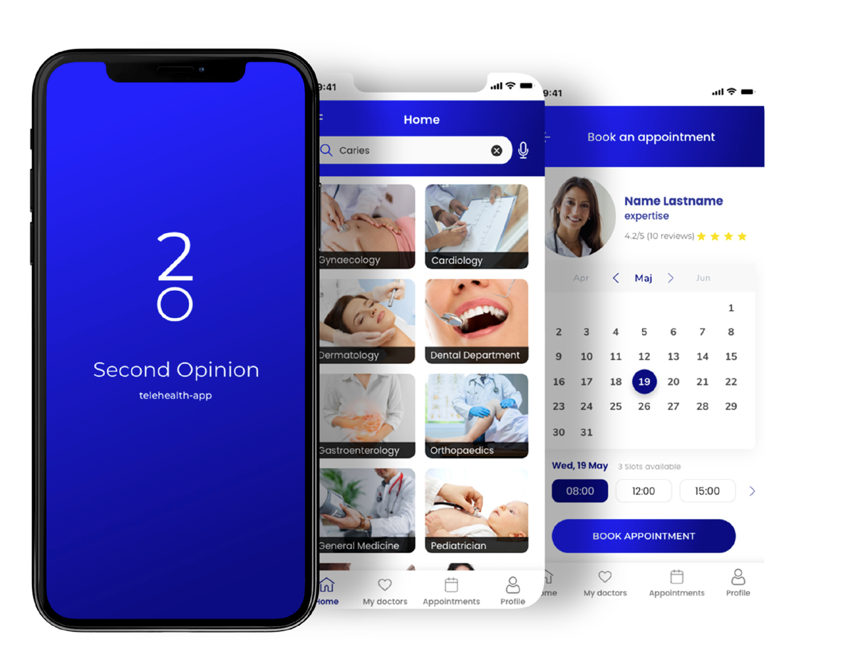
Second Opinion is a telehealth app that lets users connect easily with a doctor for a second opinion or a natural, face-to-face consultation over a video call.
My role
- UX research
- Competitor analysis
- User-flow improvements
- Low / mid / high-fidelity prototypes
- A/B testing
The team
- Stakeholders
- Front & Backend Developers
- Product Management
Deliverables
- Competitive analysis
- Surveys & interviews
- Personas
- Journey & task flows
- Site map
- Wireframes & prototypes
- Design system & UI kit
- Usability tests
Goal
Enable anyone, anywhere, to connect in a few minutes to a certified specialist through a video call.
The UX process began by understanding the business objectives and how best to serve the target audience. By comprehending user psychology and applying UX best practices, the goal was to give people a positive, memorable, and trustworthy experience.
Competitor analysis
I profiled two market leaders — Doctor On Demand and Amwell — across overview, marketing, and a SWOT and UX-competitive analysis. Both offer on-demand care without requiring insurance; Amwell stood out for its polished onboarding, Face ID entry, and accessibility options, while Doctor On Demand's onboarding and phone-number handling left clear room for UX improvement.


User stories
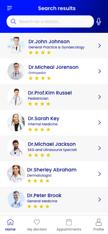
- As a user, I want to choose the best doctor by ranking, reviews, and field of expertise.
- As a user, I want to create an account with a password of 8+ characters so my account is hard to hack.
- As an existing user, I want to reset my password so I can still access my account if I forget it.
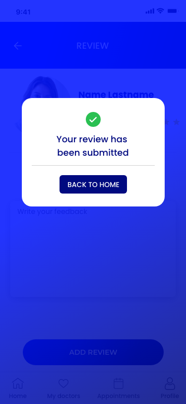
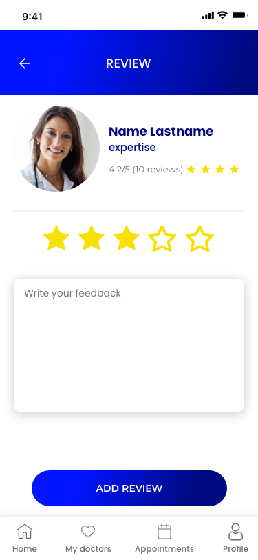
- As a user, I want to add reviews and ratings for doctors so others can find the right expert.
- As a user, I want to re-contact doctors I was satisfied with, even in a higher-priced package.
- As a user, I want notifications for successfully scheduled video calls.
Personas
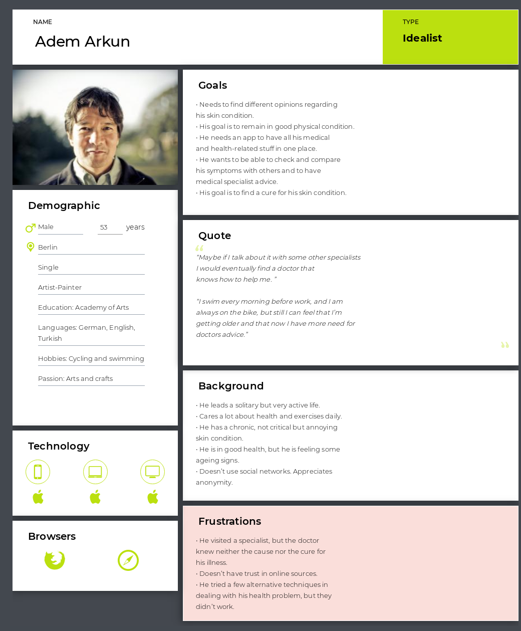
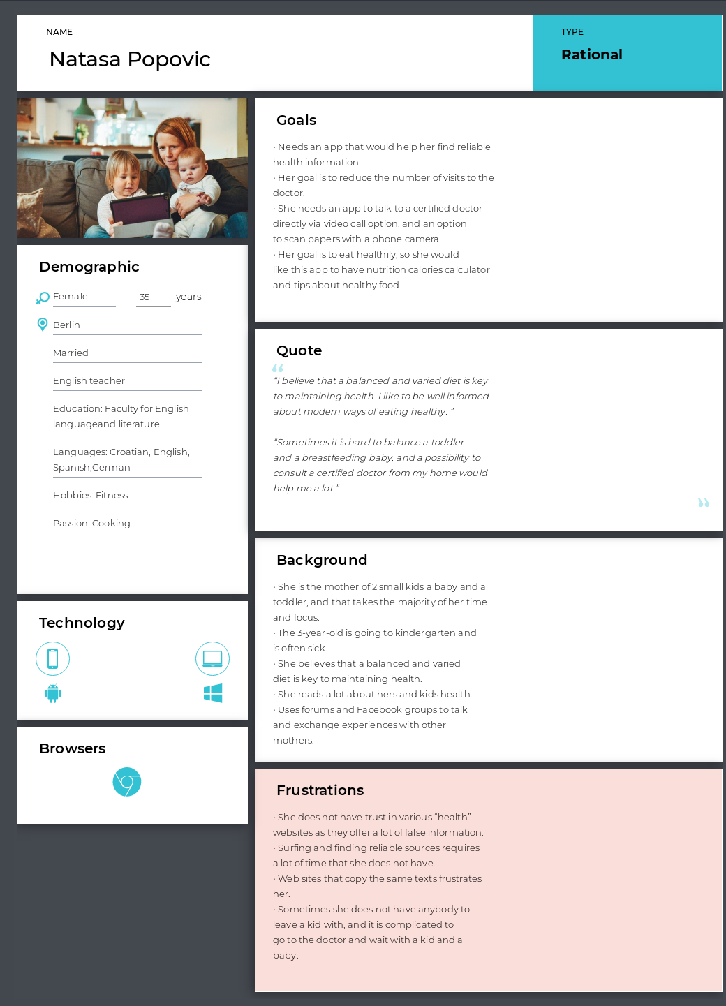
Superficially everyone wanted the same thing — to save time and money — but research revealed divergent motivations. Personas brought clarity to those differences and became key reference points as features developed.
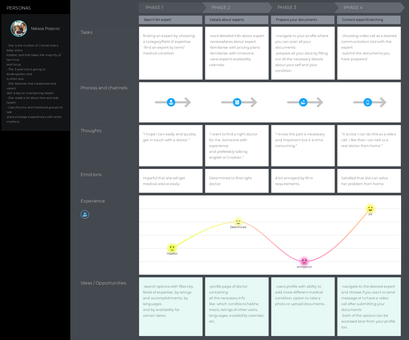
Journey maps
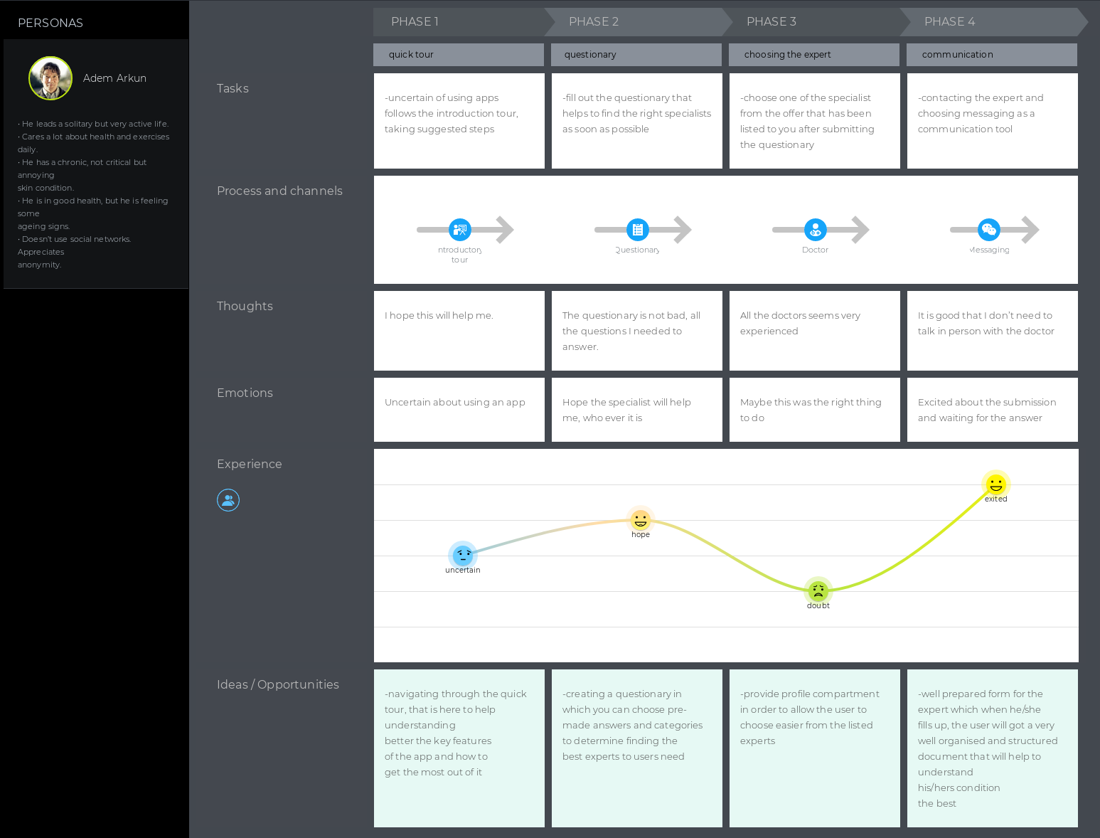
Exploring the journey maps of two personas uncovered key emotional and procedural moments the product needed to address — like the anxiety of paying for something uncertain — so the experience could build trust without introducing new friction.
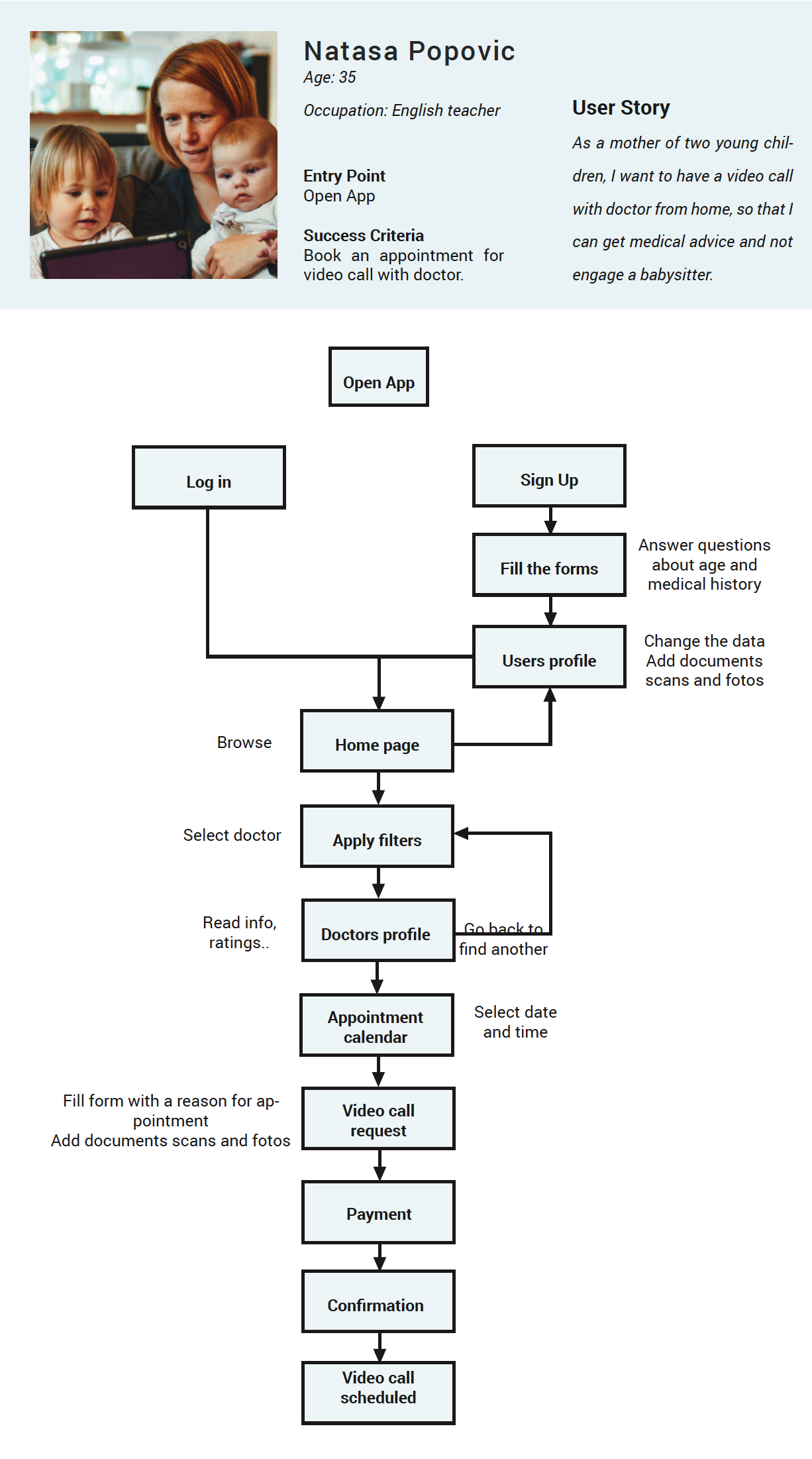
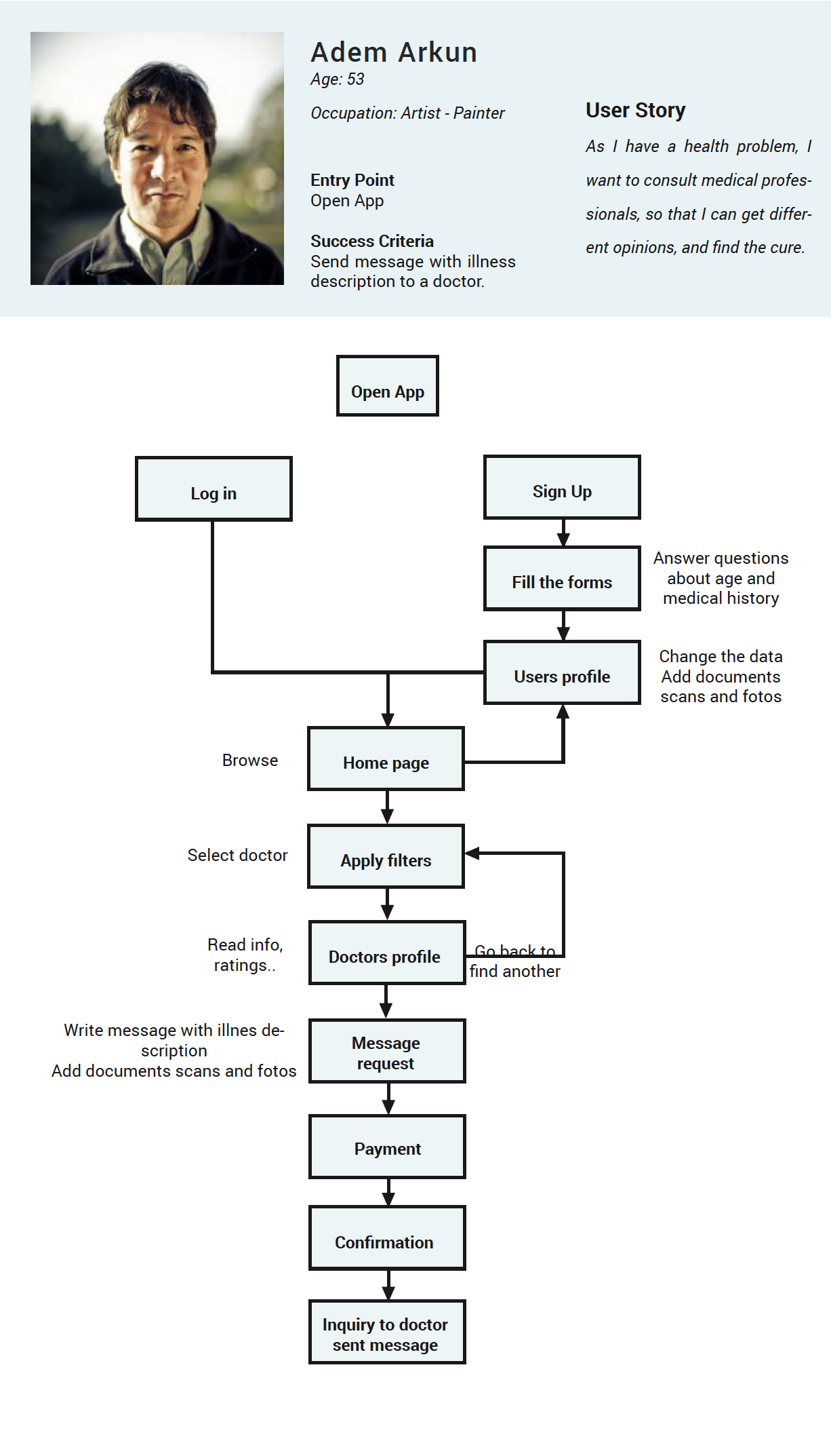
Task flows
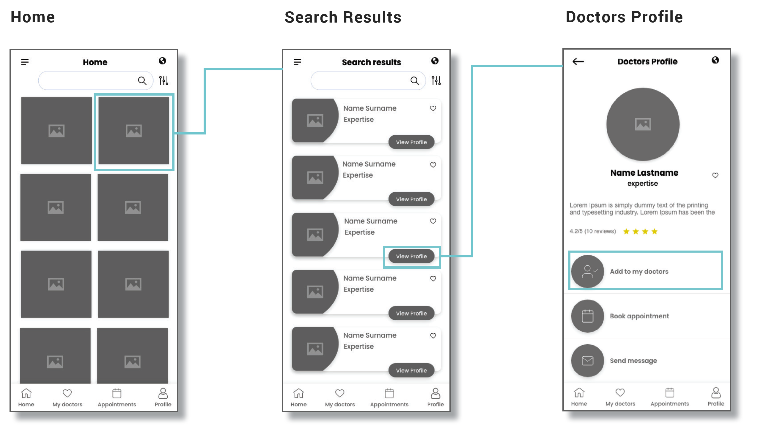
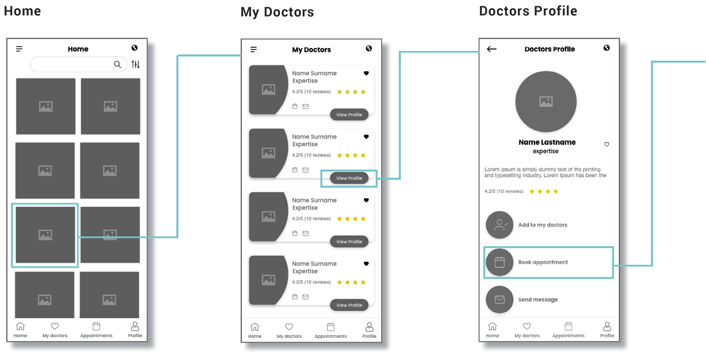
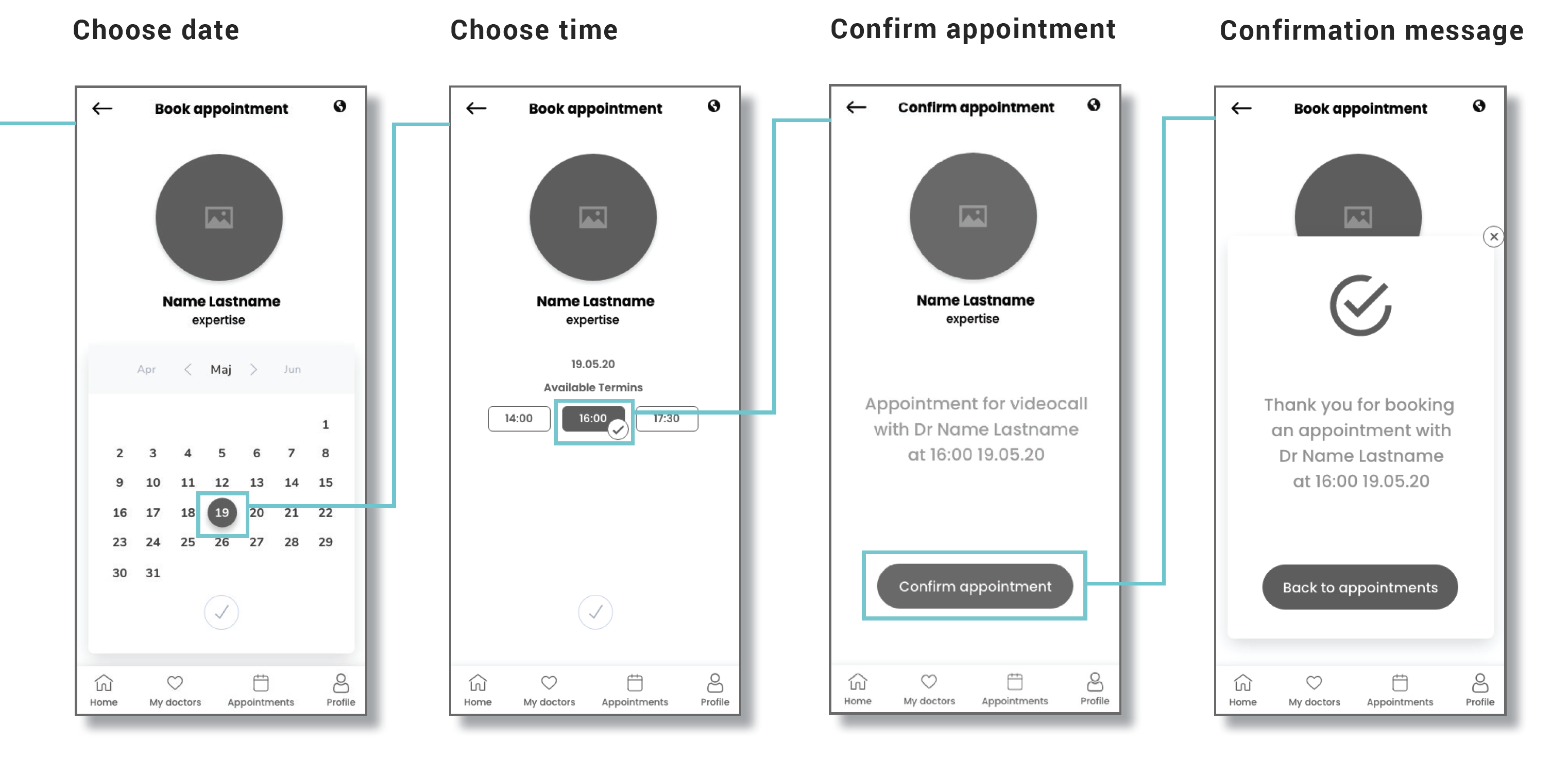
Two success criteria are shown here: booking an appointment for a video call, and messaging the doctor.
Mobile-first design
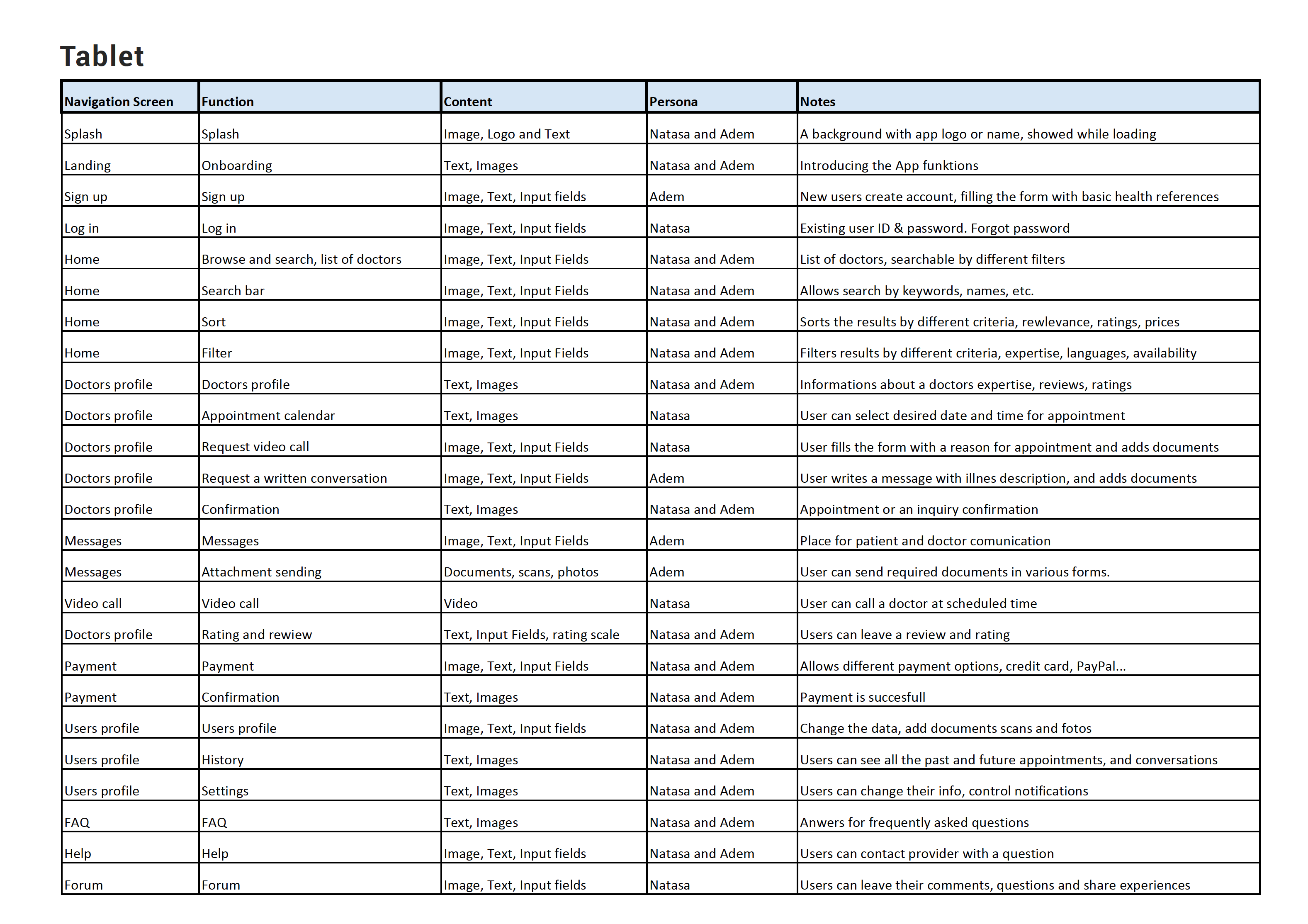
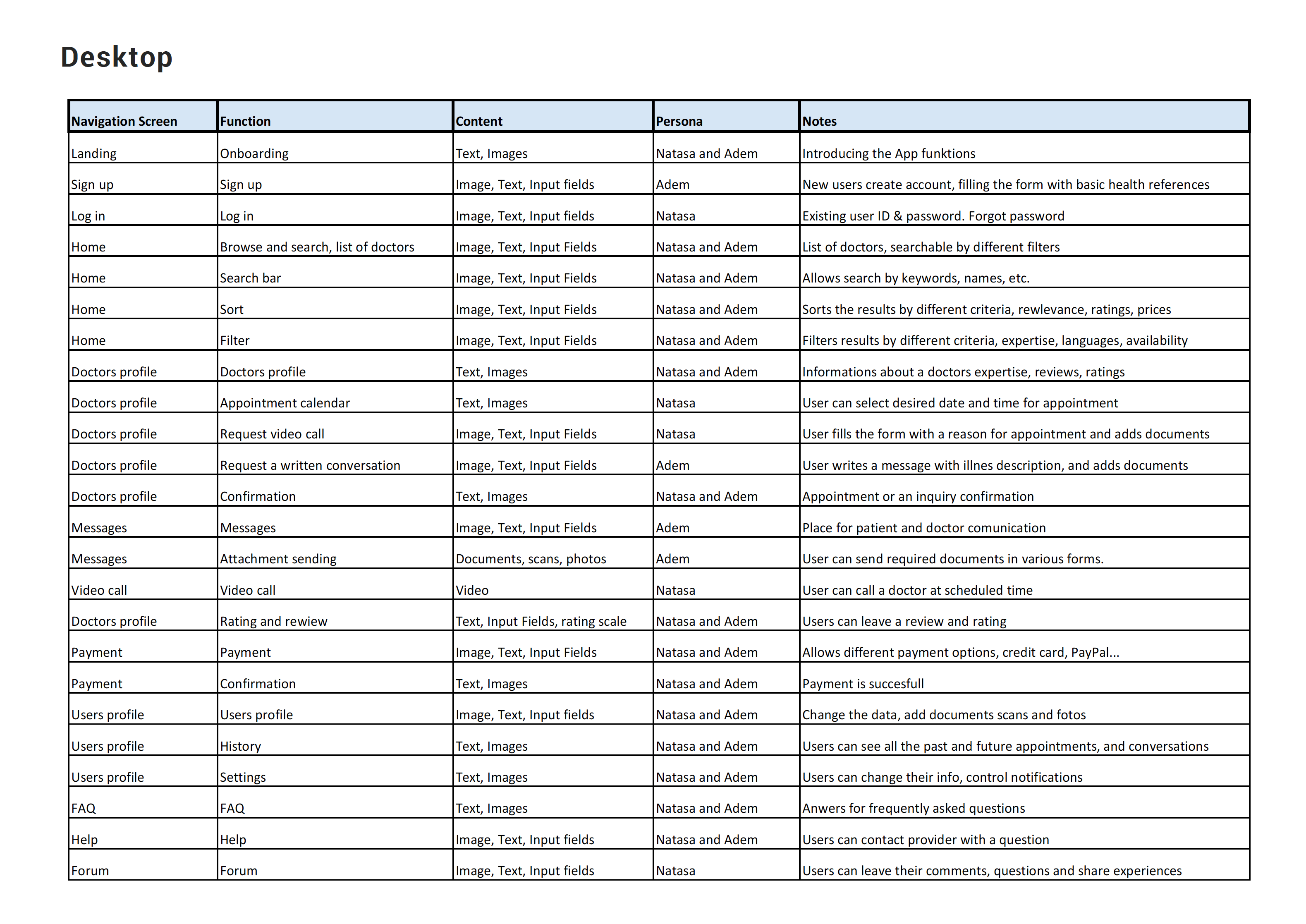
Card sorting & site map
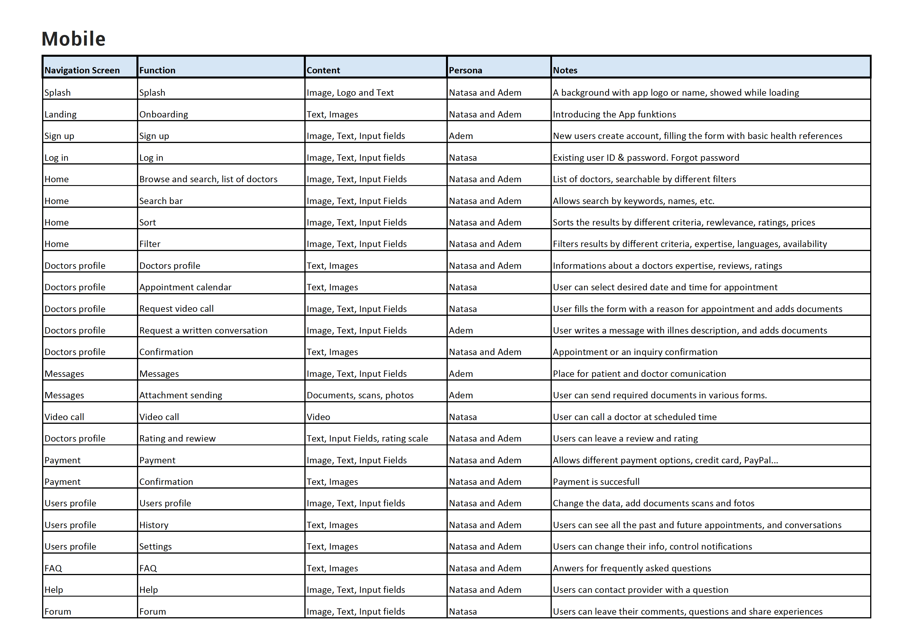
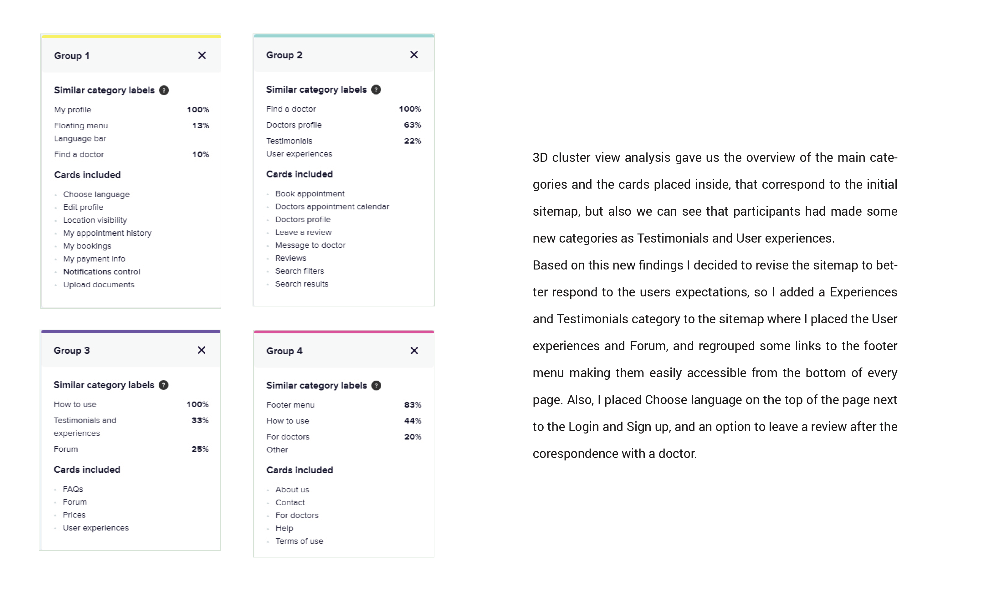
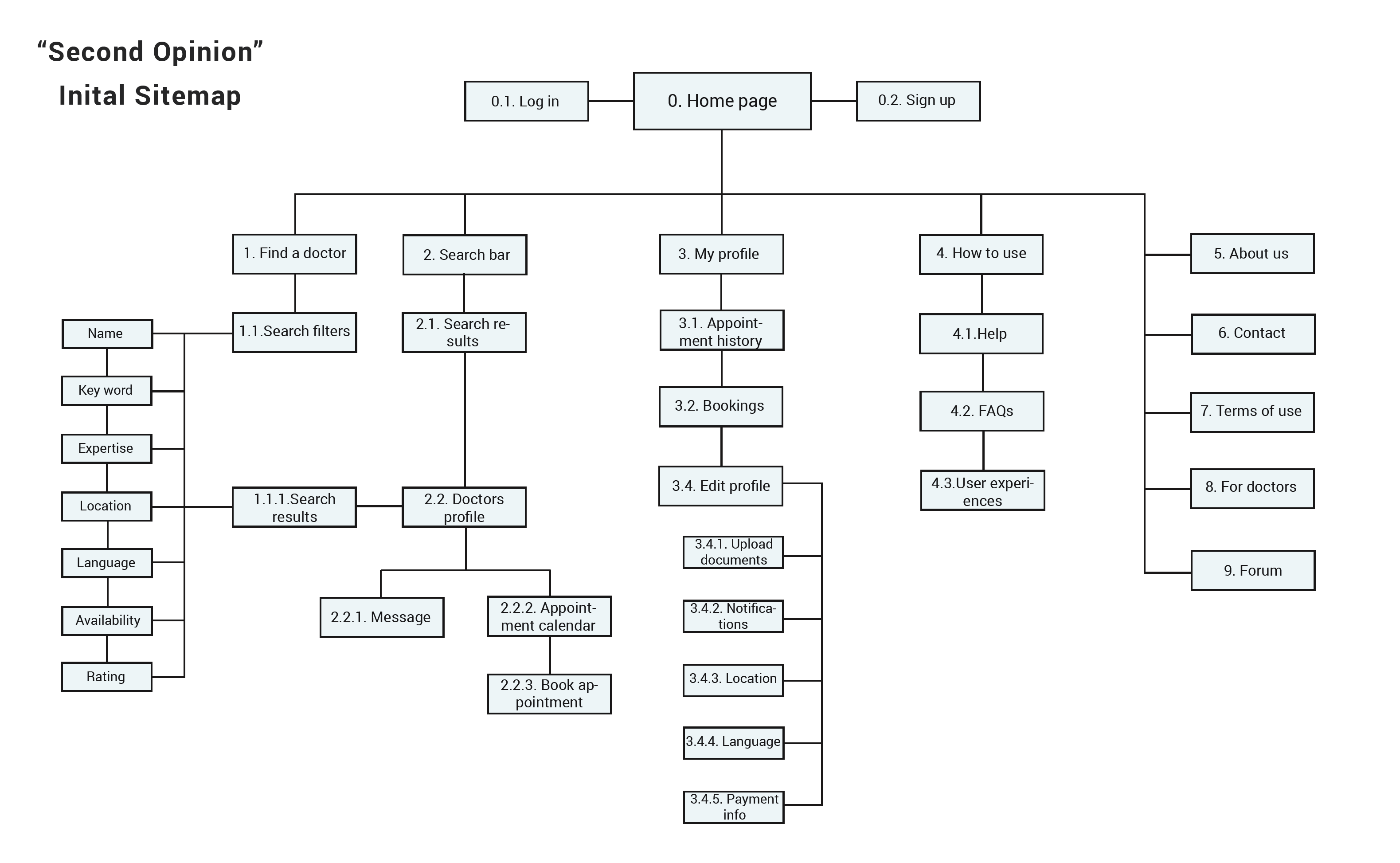
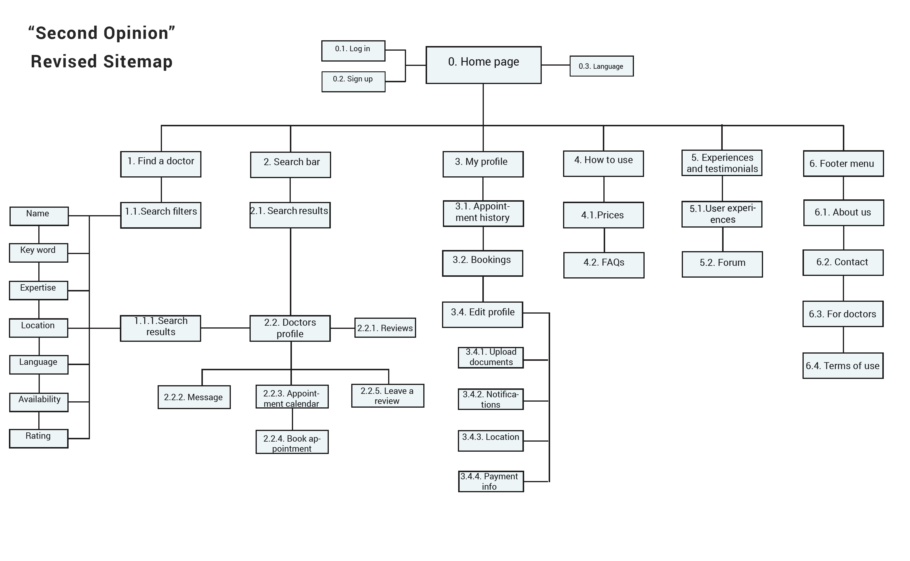
Informed by surveys and interviews, the site map organised three key task streams: onboarding and registration, management (subscribing and unsubscribing), and programming and search-related functions.
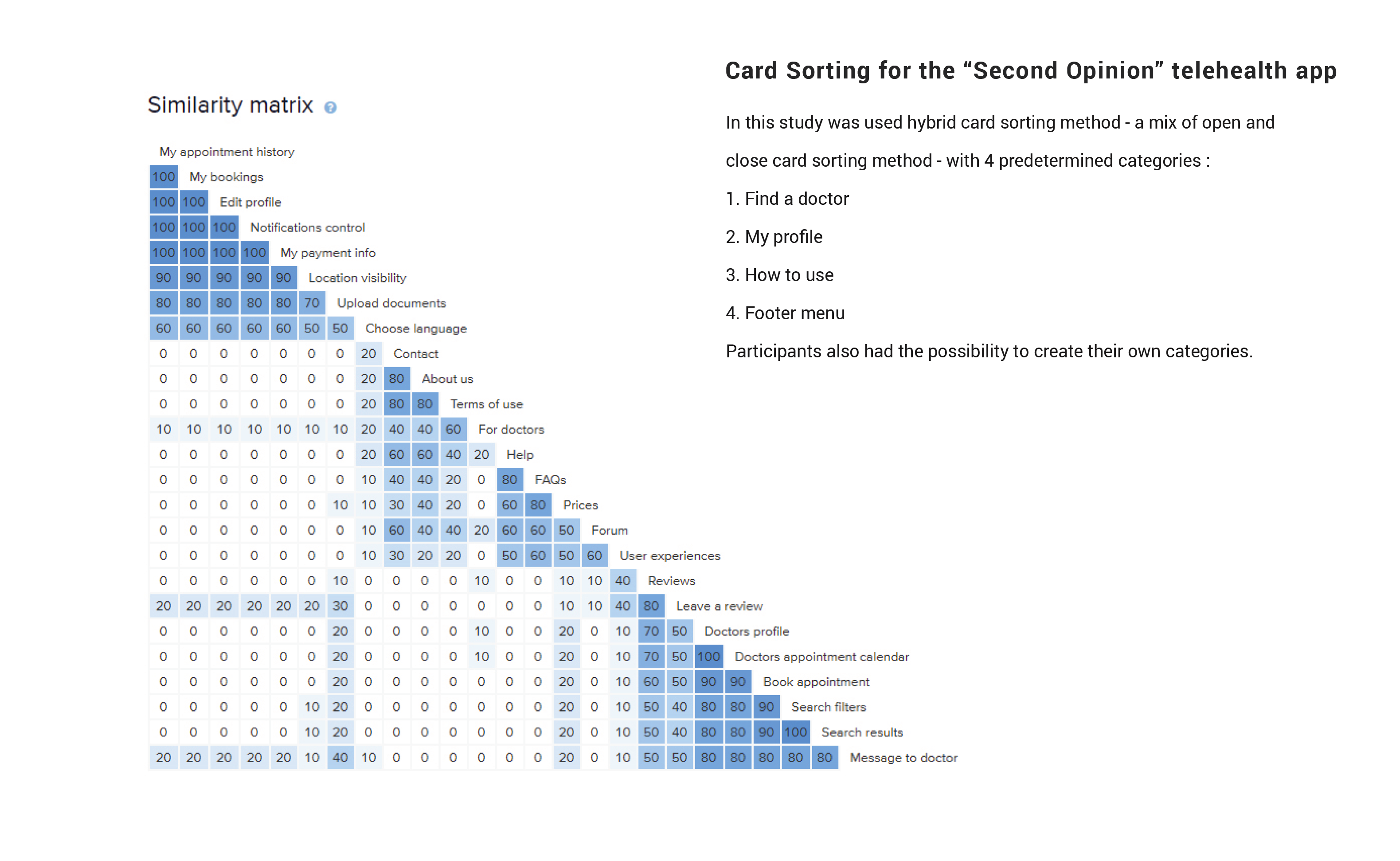
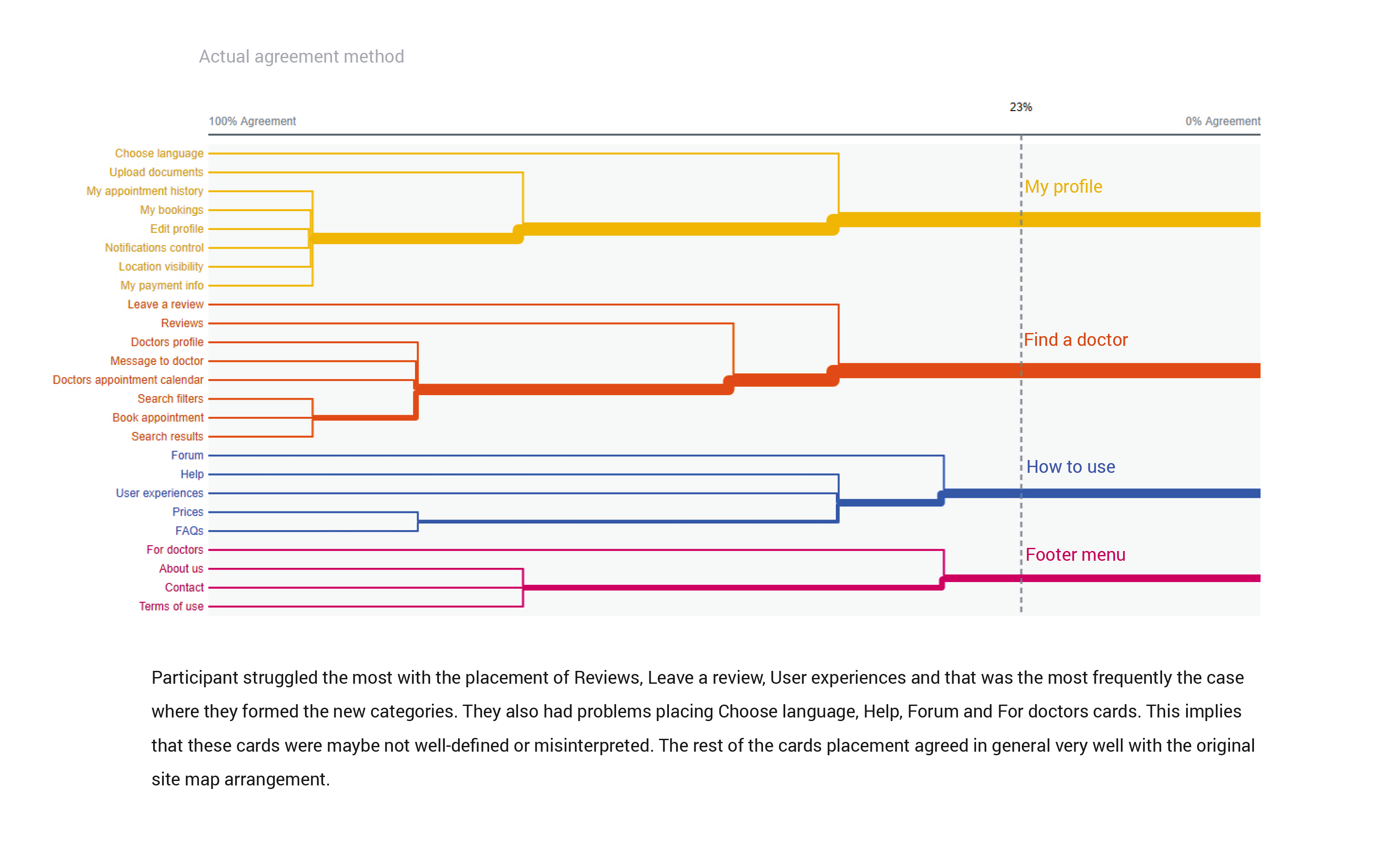
Mid-fidelity
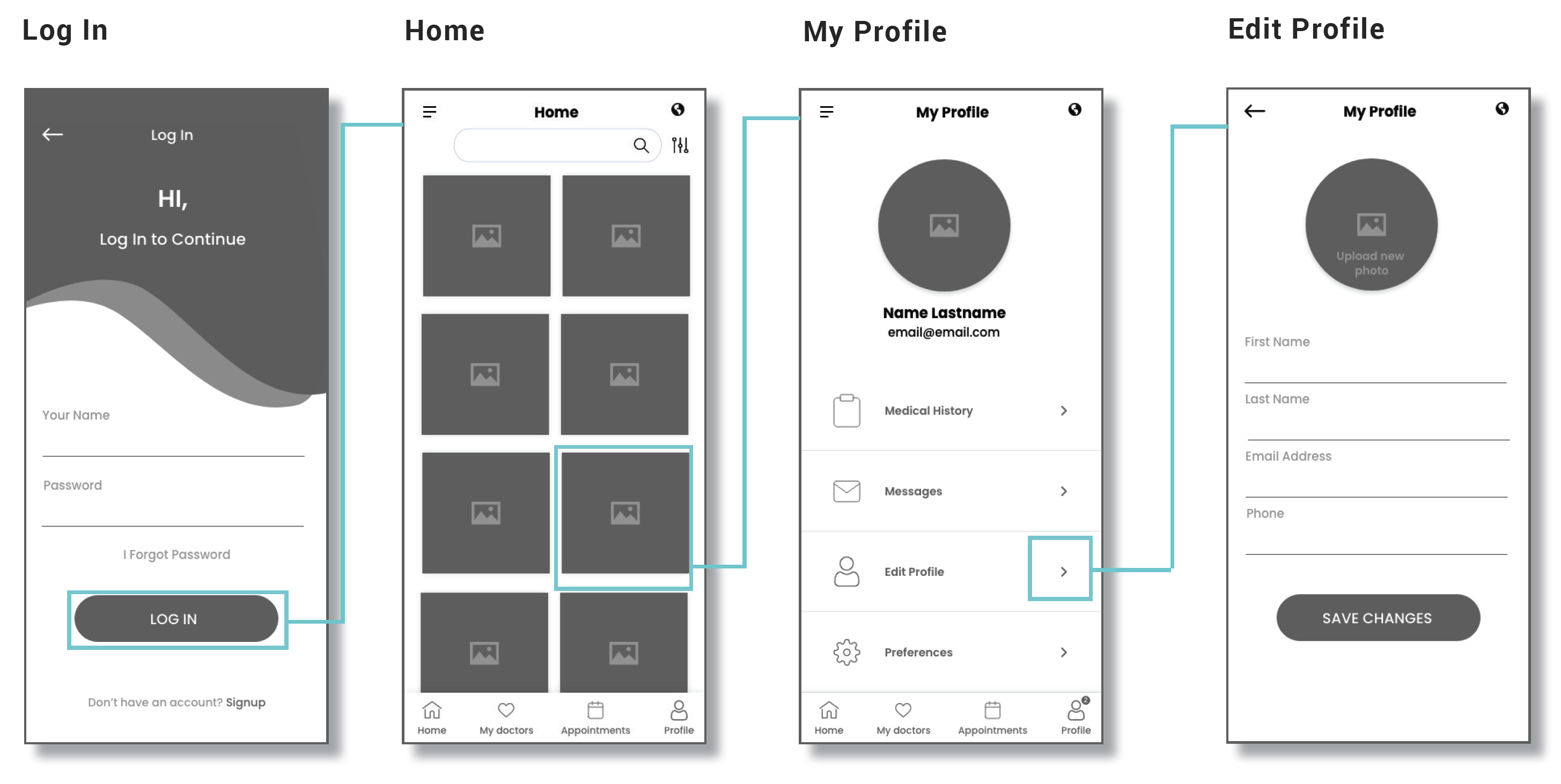
Low-fidelity testing revealed how users expected to complete tasks. Studying their touch and swipe gestures — and discussing their expectations — showed which adjustments would lay the foundation for a stronger high-fidelity prototype.
Usability test
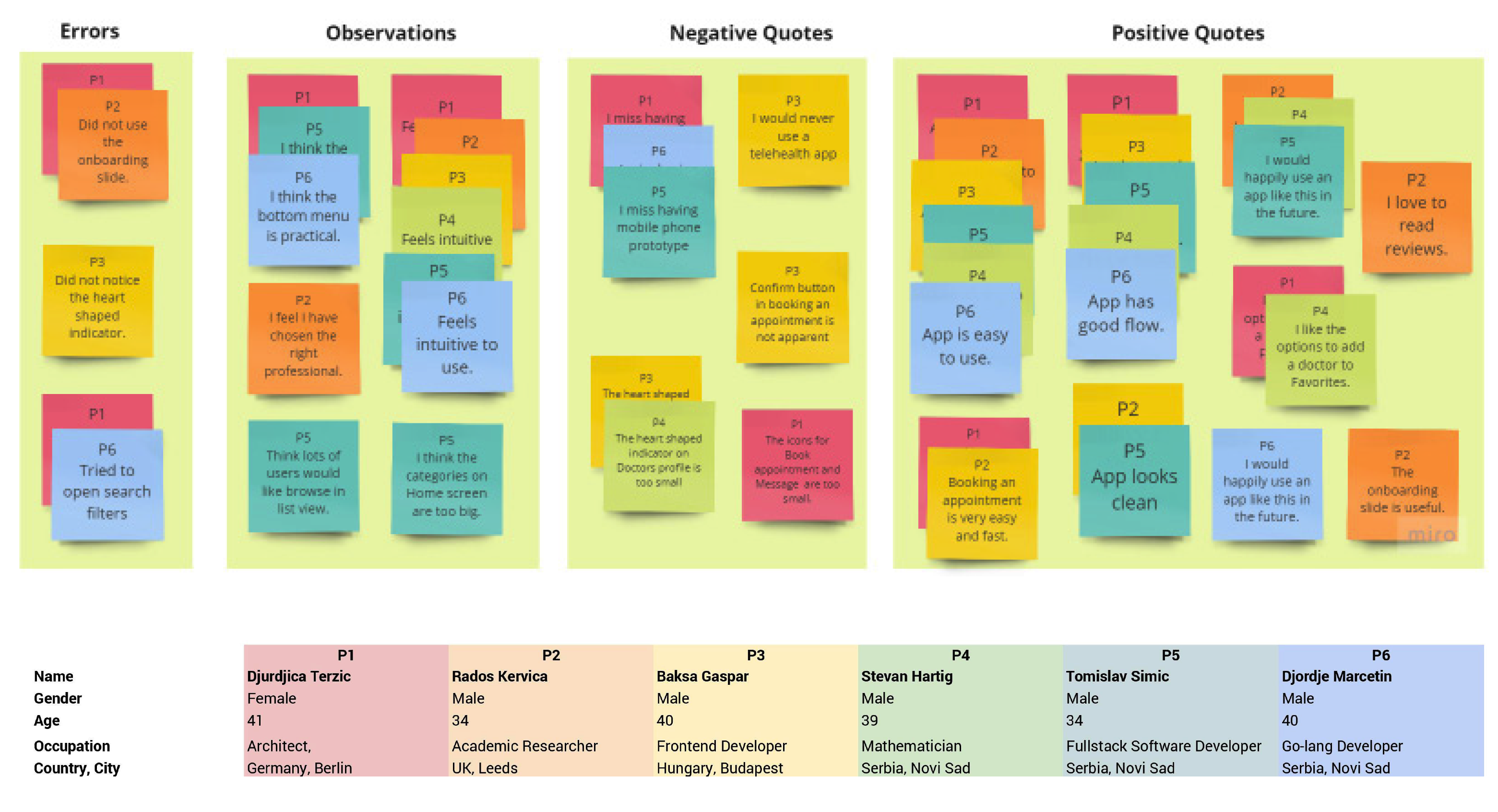
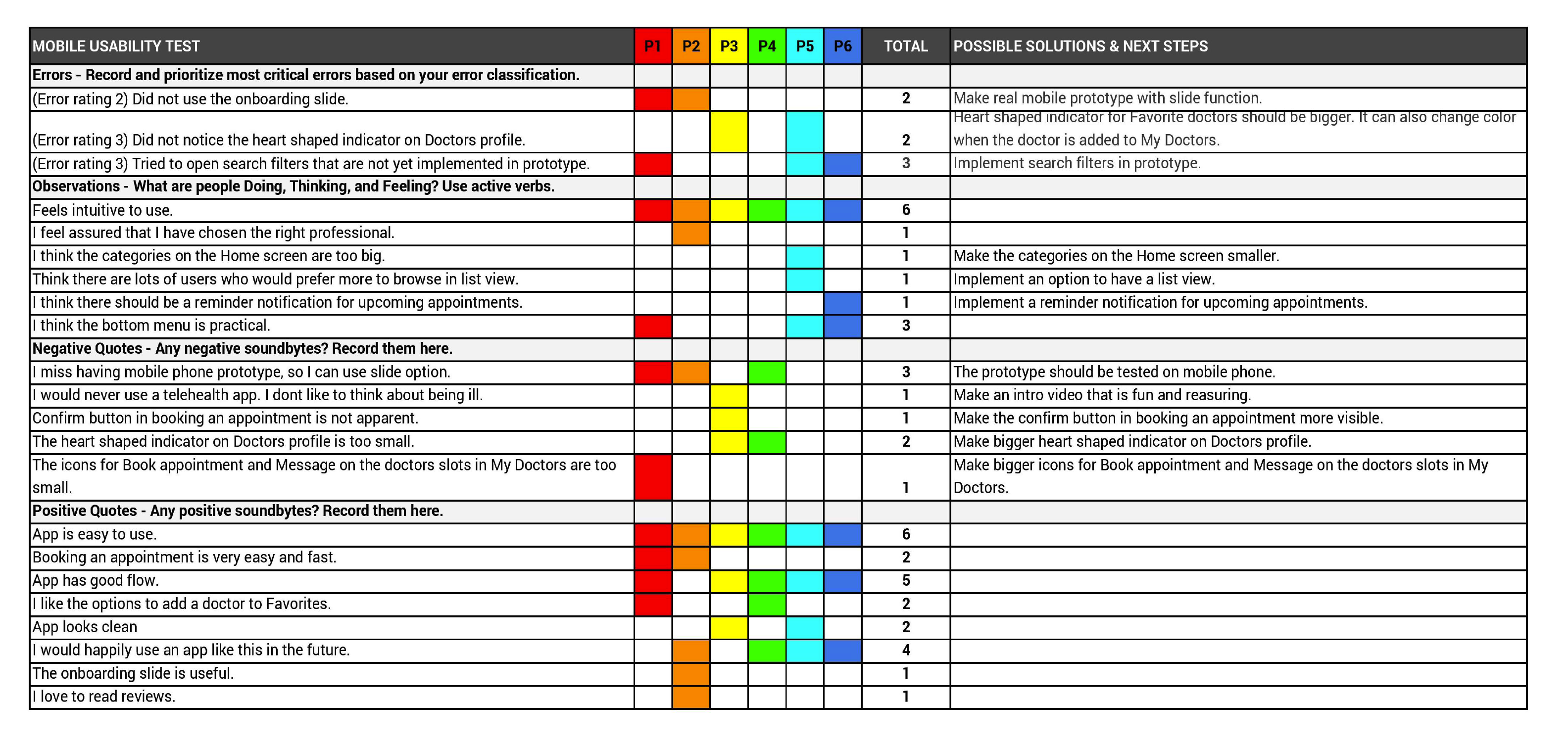
I ran a moderated remote usability test (due to the COVID-19 pandemic and to include a wider range of international participants), recruiting at least six participants and measuring issues on Jakob Nielsen's severity scale.
Gestalt principles
High-fidelity UI
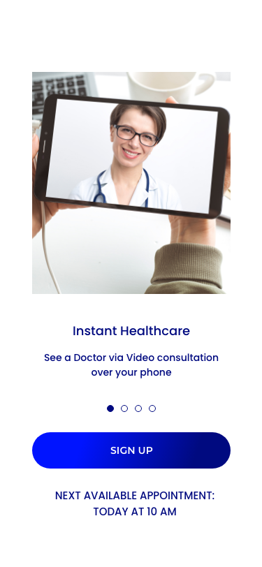
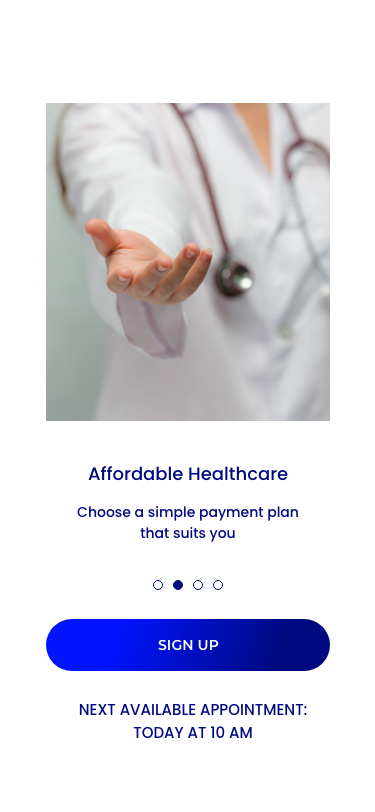
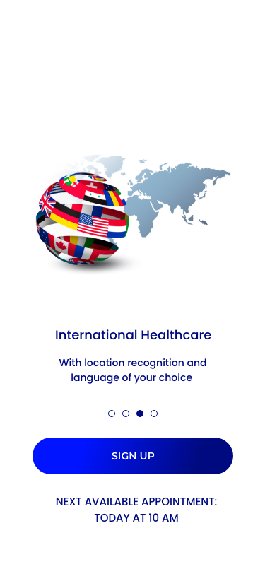
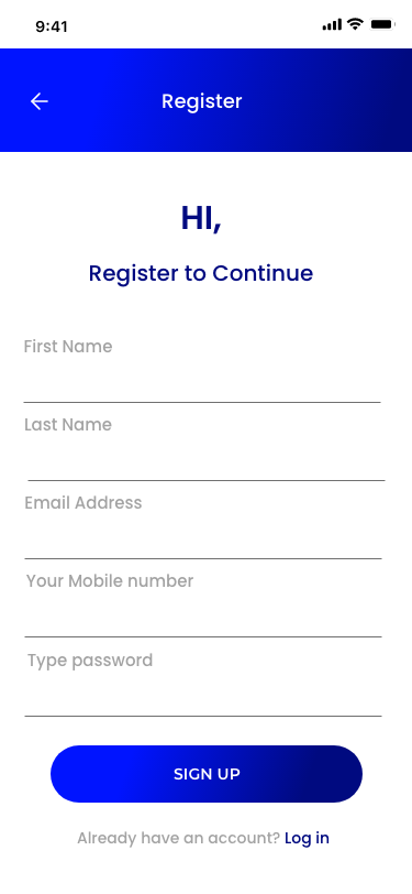
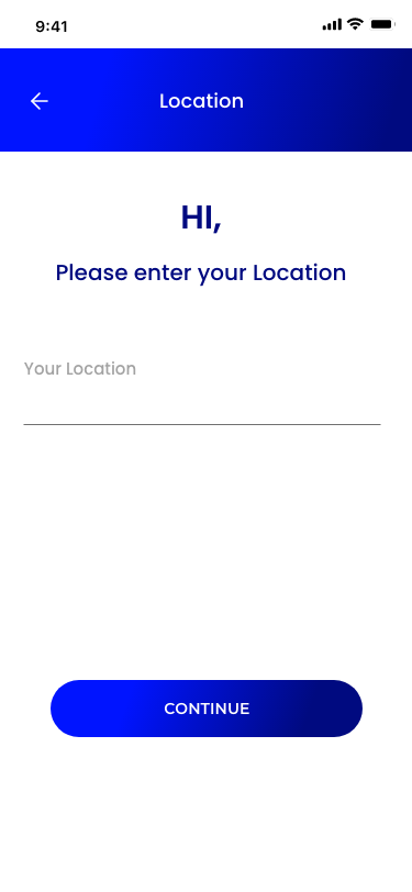
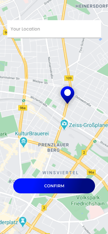
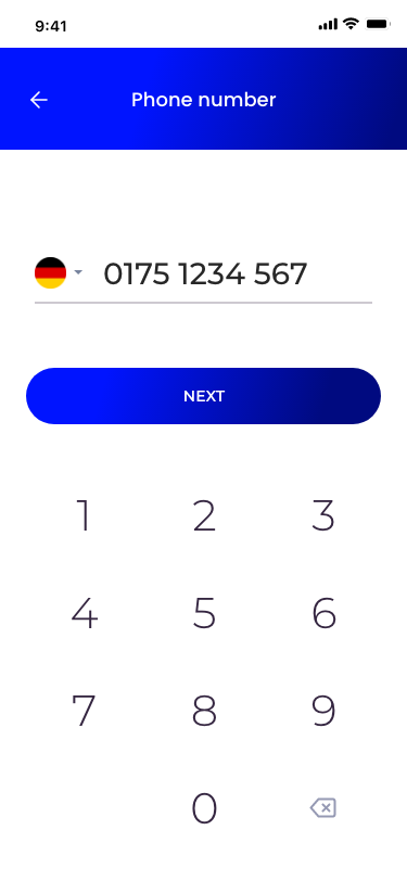
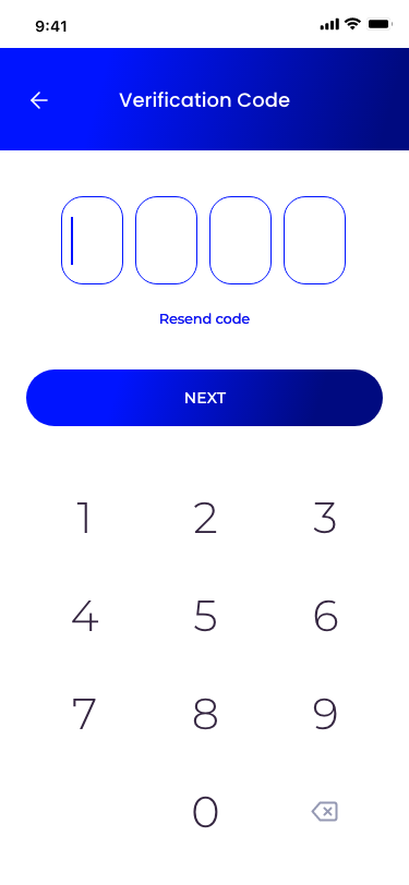
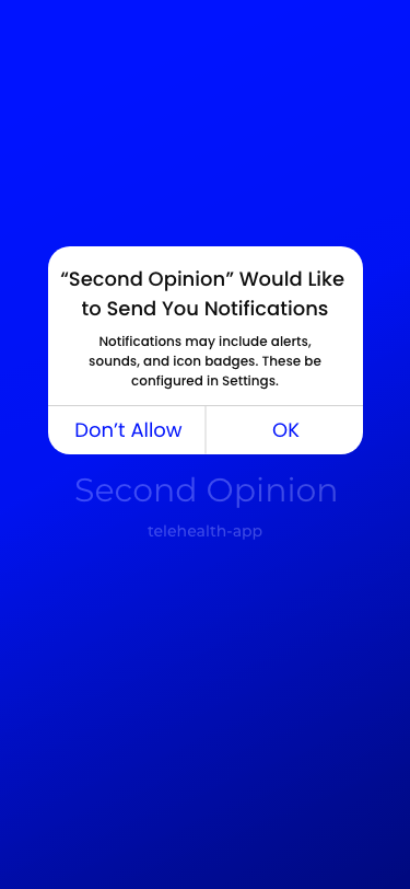
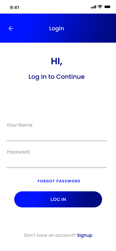
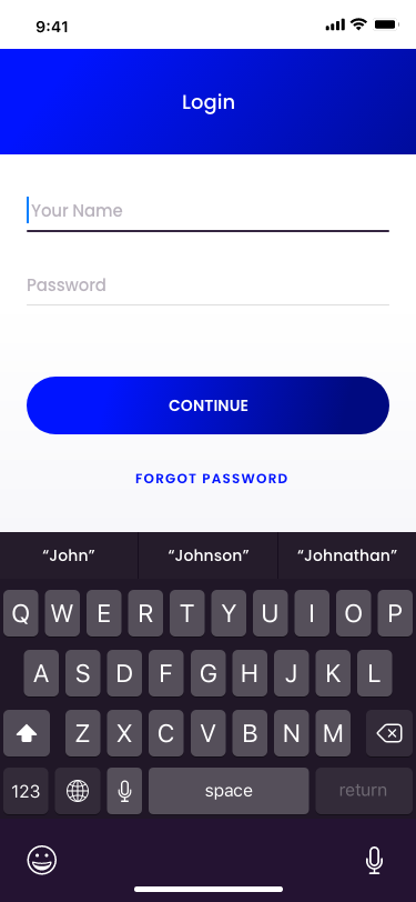
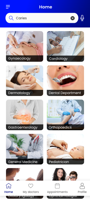
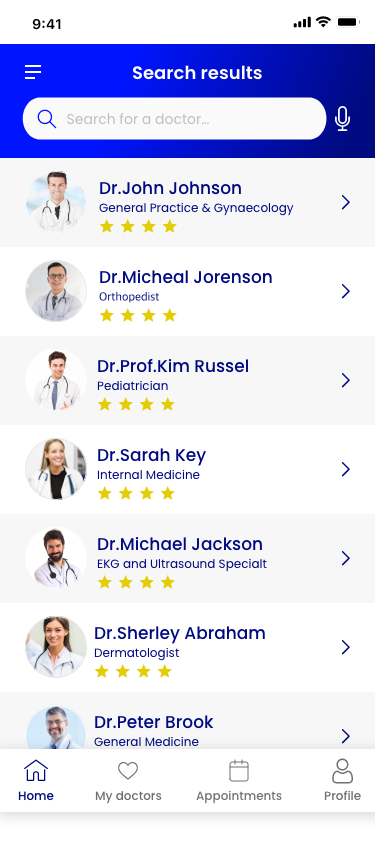
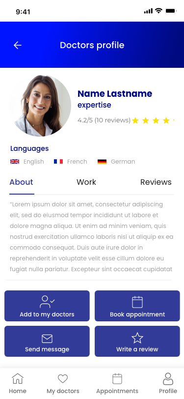
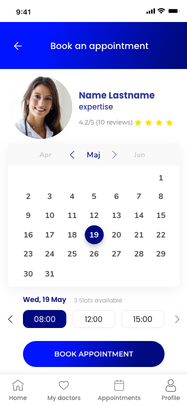
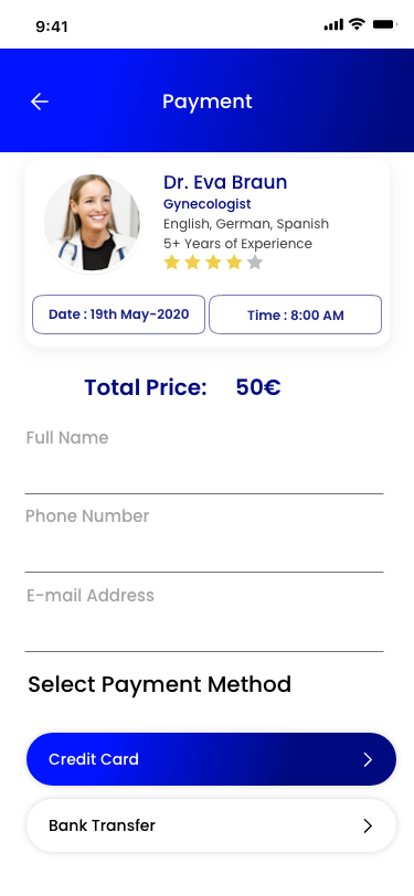
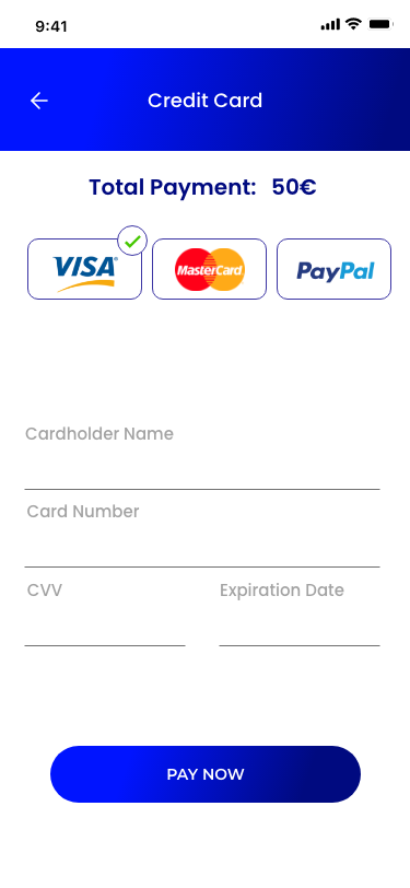
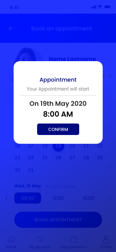
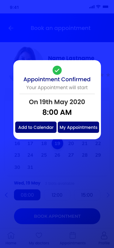
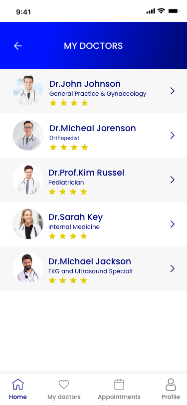
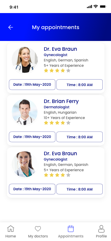
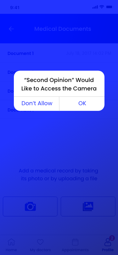
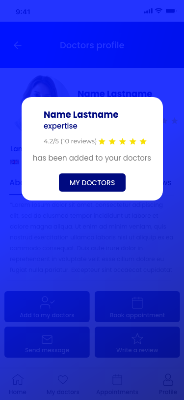
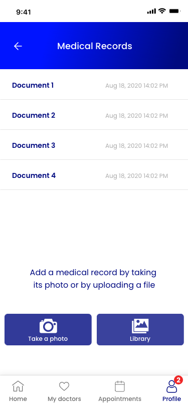
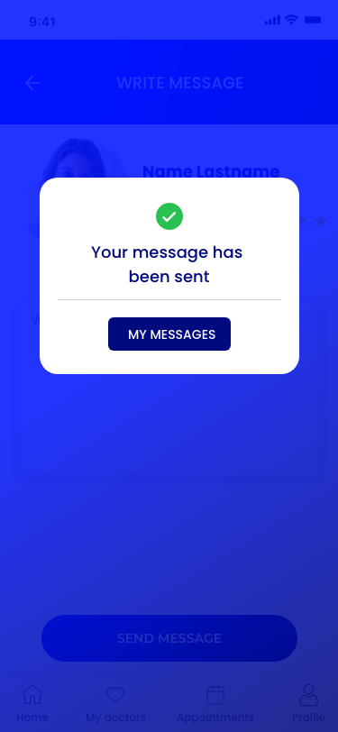
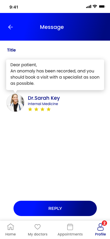
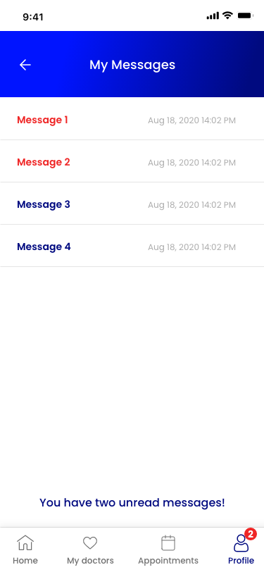
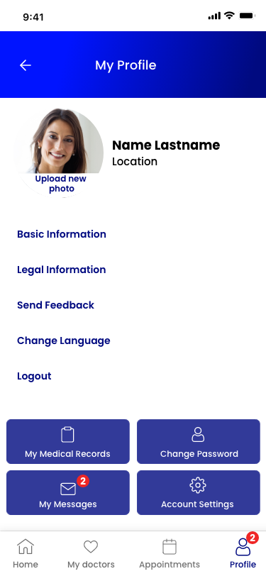
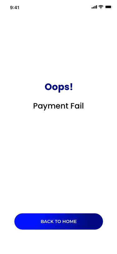
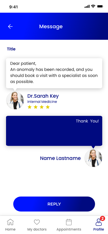
The full high-fidelity flow — onboarding, search, booking, payment, messaging, and profile.

Final words
By understanding who the users were and why they struggled, I was able to reimagine an appointment experience that helped people find information quickly and book with confidence. The relative importance of the information they sought — and the pain points in the process — came through clearly in research and testing, informing an optimised, clutter-free flow.